

Nine months after the coronavirus emerged, there’s still a remarkable lack of understanding about why the severity and course of COVID-19 vary for different people. Part of the problem is that we haven’t prioritized gathering and reporting data in enough detail. Most countries just report the age and sex of people who have died of COVID-19. This isn’t enough if we want a better understanding of the disease.
When looking at basic COVID-19 data, there are patterns that undermine what we think we know, such as men being more at risk, but these remain unexplained without knowing more about the demographics and health conditions of those infected. If we had that information, we’d be able to better investigate, prevent and control COVID-19, just like we are with diseases where richer information is available.
Detailed data improves health
Reporting more data so that cases of disease can be broken down into subcategories is known as “disaggregation”. It allows further insight and can give patients better outcomes. Over the last two decades in the US, for example, breaking down the prevalence and outcomes of heart disease and stroke by sex, gender, ethnicity and age has significantly improved how it is managed.
Disaggregated data shows that African American patients with heart disease tend to be younger and have multiple related conditions—such as high blood pressure and diabetes—that make heart disease worse. It also shows they have less access to preventive care. This is all critical information for subsequent treatment, and thanks to knowledge gained through disaggregation, is now included in treatment guidelines. These factors could easily otherwise be overlooked.
A similar analysis of detailed data has demonstrated that the effects of cholesterol-lowering statins differ between European, Asian and African patients. This can lead to more appropriate prescriptions and dosages.
Disaggregated data can also show where biases in treatment lead to disparities in outcomes—for instance, between men and women, or black patients and white patients – and so highlight where practices need to change.
COVID-19 death rates a mystery
With only age and sex data available, we can’t provide these sorts of detailed insights into COVID-19. But unexplained patterns in the data we do have show that there’s more insight to be gained—if we can collect more information.
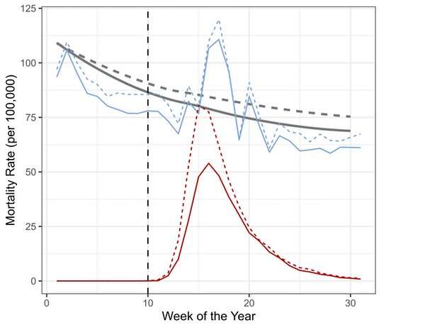
The following graph—which presents the death rate of over-65s in England and Wales across the first 30 weeks of this year—illustrates this.
The rate of COVID-19 deaths is shown in red. The rate of death from all other causes in 2020 is in blue. The gray line shows the average of the overall death rate of the previous five years. The data is also broken down by sex: dotted lines for men, solid lines for women.
There is the obvious spike in COVID-19 deaths, rising sharply around week 13 and declining rapidly after week 16. In the weeks around the peak, many more men were dying than women—as shown by the dotted red line peaking higher than the solid one. This observation, also seen in global data, led to the conclusion that men are at greater risk of dying from COVID-19.
Based on this, there’s been lots of speculation as to why. There are theories about why the male immune system may be less effective against the virus, why the virus might more easily enter men’s cells, or how gendered activities, such as smoking, may play a role.
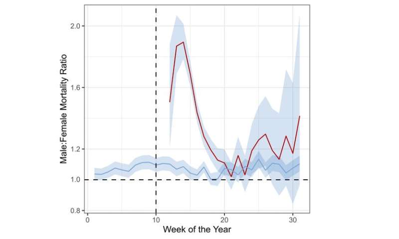
Yet by week 20 on our graph—just ten weeks after the first death—men are no longer dying in much higher numbers than women. The two red lines converge. This change is shown more clearly in the graph below, which shows the ratio of deaths between men and women for this period.
The fact that the male-female ratio for COVID-19 deaths isn’t consistent, but rises and then falls, shows that the association between sex and COVID deaths may have been overinterpreted in the early days of the pandemic. Data from the later stages of this pandemic suggests men and women may be equally susceptible to severe disease.
Going back to the first graph, there’s also a sharp rise in the number of non-COVID-19 deaths for both men and women—shown by the blue lines rising above the gray ones. This is “excess mortality”—that is, deaths above and beyond what would be expected based on previous years.
Again, because of a lack of data, the reasons for the striking spike in non-COVID deaths is unknown. Speculative reasoning would suggest a combination of health-service failure, fear of going to the doctor when ill because of a potential increased risk of coronavirus exposure, concerns about over-burdening the health system, or a failure primary care to maintain services for people with chronic diseases.
But the truth is: We don’t know.
What we should be doing
Put simply, hospitals need to start collecting and reporting detailed data for COVID-19 patients. This means data on “social determinants” that affect people’s health outcomes—such as race, ethnicity, occupation and socioeconomic status—as well as people’s medical histories and information on pre-existing conditions.
While we know that many medical conditions are associated with severe COVID-19 – diabetes, high blood pressure and obesity are a few examples—the available data doesn’t show whether appropriately managing these conditions has an effect on COVID-19 severity. If it does, then a clear action for policymakers is providing access to preventive care for the underlying condition.
For researchers to conduct this type of analysis, governments should require hospitals to share the data they collect, including with the World Health Organization—it has already set up a platform to draw such information together.
Source: Read Full Article