
Using data from the widely circulated Johns Hopkins COVID-19 tracking map, a cross-disciplinary team of JHU researchers recently began developing an array of new data visualization tools to help animate and explain the trends driving the pandemic, giving users real-time insights into how it is evolving around the world.
The effort is led by the Johns Hopkins Centers for Civic Impact, in partnership with the Johns Hopkins Applied Physics Laboratory, the Whiting School of Engineering, and the Bloomberg School of Public Health. The Johns Hopkins COVID-19 tracking map, developed by associate professor Lauren Gardner and her team at the Center for Systems Science and Engineering, has become a definitive source of information about confirmed cases of novel coronavirus and related deaths around the world. Launched in January and shared on an open source platform to invite collaboration across the globe, the map’s data is currently accessed more than a billion times each day.
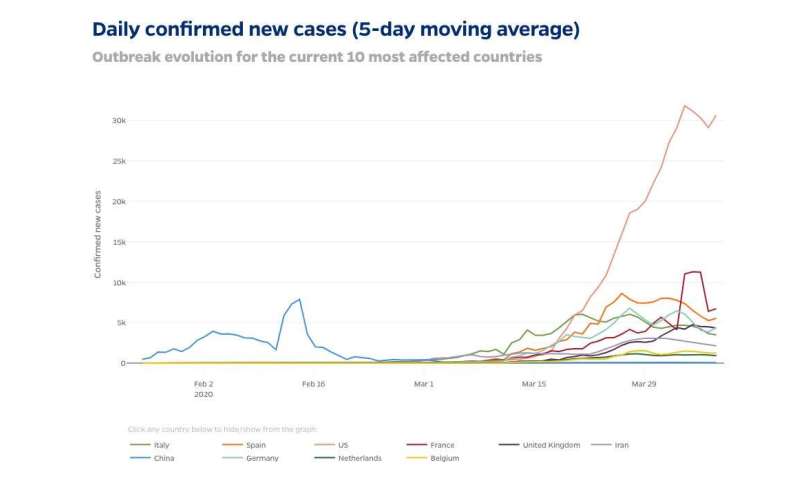
Among the new tools to debut recently, one tracks the numbers of new cases of COVID-19 per day in the 10 most affected countries. The charts give real-time feedback on the success of each country’s efforts to “flatten the curve” by slowing the spread of infection. Another feature charts cumulative cases of COVID-19 by date in those same countries, which include the U.S., Italy, Spain, China, and the U.K. A third tool provides data on mortality rates in more than 110 countries.
“Visualizing the trends of COVID-19 helps everyone understand more concretely how and where the pandemic is spreading,” says Beth Blauer, executive director of the Centers for Civic Impact. “This is valuable not only for policymakers but also individuals who are being asked to make incredible sacrifices to stop the spread of the disease.”
Blauer is leading the data project along with the center’s chief data scientist, Sara Betran De Lis. The new tools leverage data collected and updated by Gardner’s team round the clock.
“We’re taking that data and giving it extra analytics firepower,” Blauer says.
In the weeks ahead, the team will launch an expanded, data-rich U.S. map that incorporates COVID-19 tracking data as well as demographic and economic trends.
Source: Read Full Article